DEVOUR-Home Cooking Education and Social Media
Responsive mobile website.
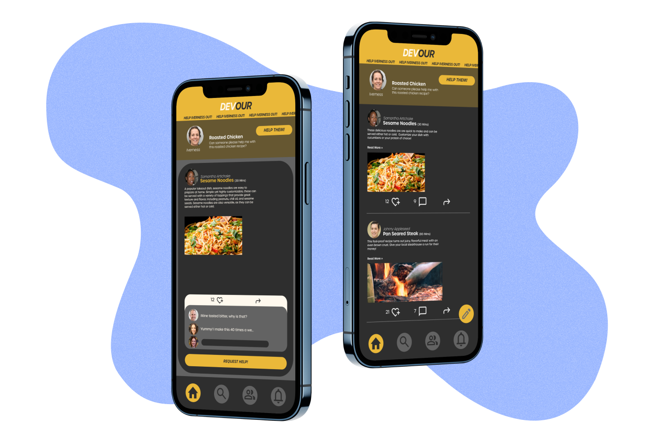
HELP ME OUT!
HELP ME OUT!
The Brief
Home cooking is dramatically increased during the past few years due to global pandemic and inflation. Amateur home cooks want a low-cost way to practice what they’re passionate about and learn from experienced practitioners.
This is a design project when I was studying at General Assembly UX bootcamp. In this team project, I collaborated with two other UX designers and researchers. We’re given a topic “Education”. We honed on home cooking education space and designed a brand new responsive mobile website and desktop website-DEVOUR. It is peer-to-peer home cooking education platform. We all contributed to helping out with user research, design and usability testing.
Duration:
2 Weeks
July, 2022
Deliverables
Wireframes
Prototypes
User Flow & Annotations
Usability Testing Reports
Branding
My Role:
UX/UI designer
User Researcher
Solutions
How might we enable people with interest in cooking to sharpen their skills and learn new and quick dishes directly from their communities?
Design process
User research
We started our research to understand users’ home cooking experiences. We used recruit 5 participants to one-on-one user interviews. They cooked frequently as target audience. The research goal is to find what a typical “home cook” needs and wants. Here are some examples of interview questions:
How did you learn to cook? Was any one person influential to your cooking experience?
What resources do you find inspiration from?
How do you decide what to cook?
Will you comment on it or share it?
What I’ve Learned from Users?
Most users like to cook quick and easy meals
Learned cooking from family and friends at first
Get inspirations from different online resources
Share recipes within their communities
Rarely comment on online resources
Comfortable to request help within their communities-family and friends, the people they know.
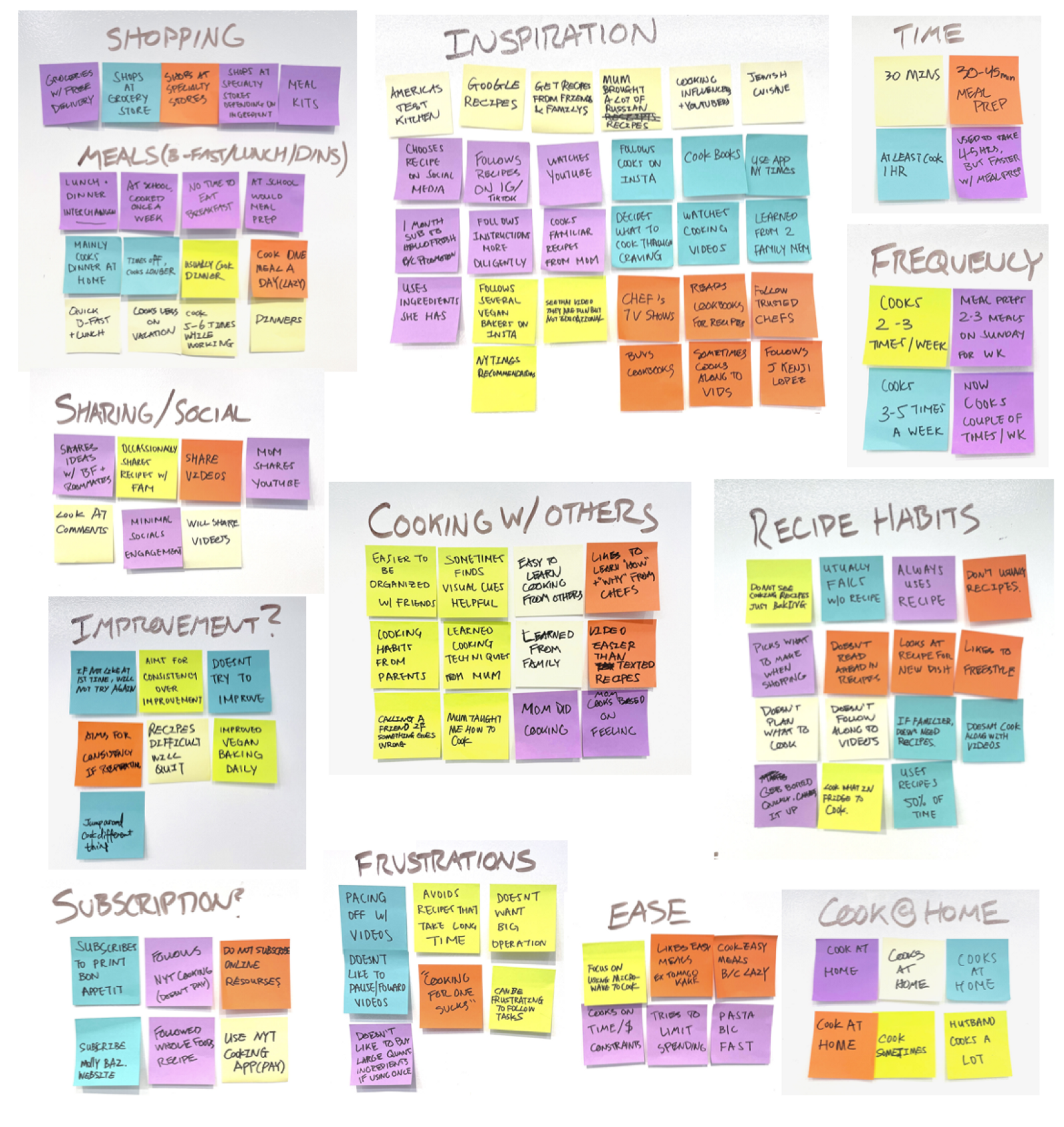
We used affinity mapping to synthesized the user’s observations and find out the potential solutions:
I found that most users are more comfortable to request help from the people they know such as family and friends. Then I suggest my team to hone in on connecting family and friends in a peer-to-peer product rather than concentrating energy to a peer-to-pro-chef model, which significantly influenced our initial design solutions.
Persona and User Journey Map
With the insights from research synthesis, I created a persona, “Sophia”, as a representative of target audience to help guide the remainder of our research and design process. We can ensure that we are focusing on the user’s needs and goals in our design process.
Followed by “Sophia”s journey map which outlines the steps and system touch points that she encounters while completing a specific task. We found the emotional experience curve trended positive during the “Find Inspiration” phase, but getting negative once the user started to prepare and cook the meal. User is lack of immediate assistance when struggling with recipes. However, even during the “Find Inspiration” phase, there were both highlights and pain points at many of the user steps, pointing to potential areas for improvement even during a relatively enjoyable phase of the task.
Feature Prioritization
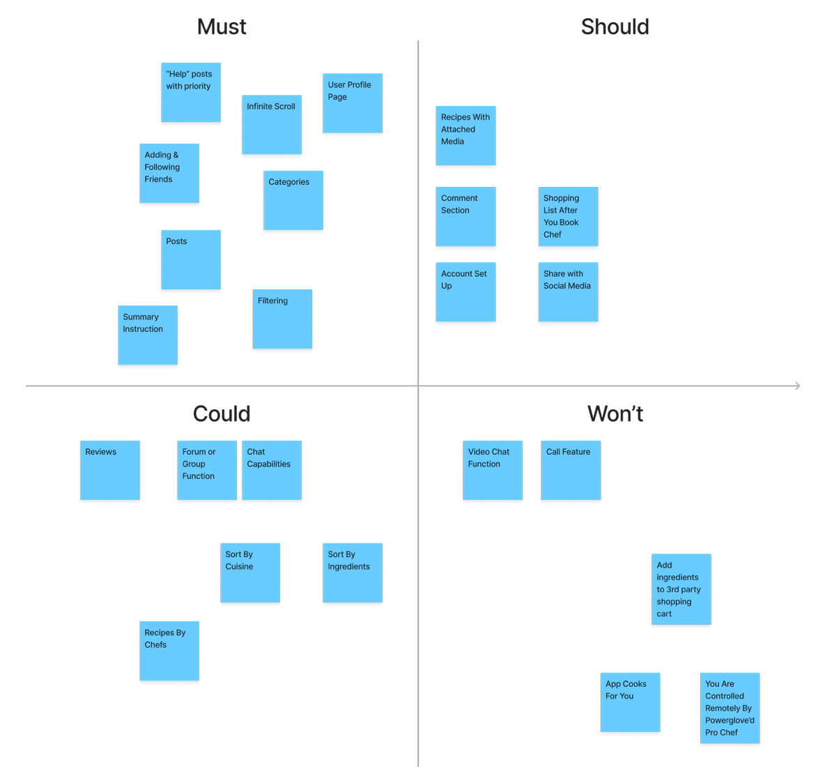
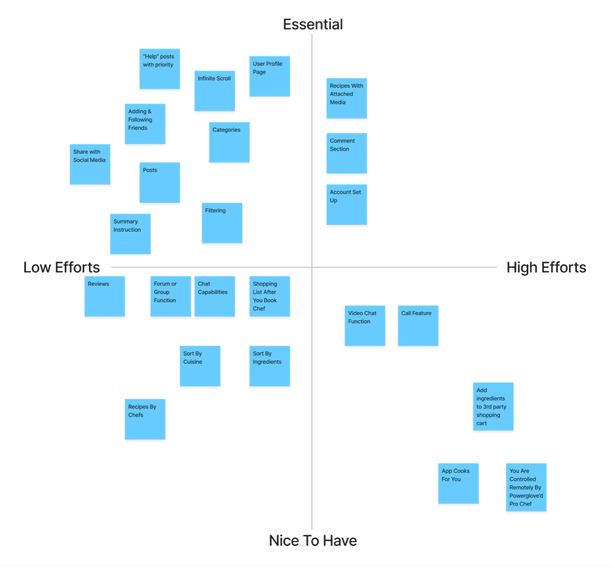
Before the design stage, we used feature prioritization matrix to determine which features we will include in our product. This is an important step to the process as it helps us prioritize our energy into the most useful pieces of our product.
We prioritized infinite scrolling, the ‘help’ feature, posts, faceted search, and friends. Additionally, after much deliberation we came to a tragic conclusion that we did not have the resources to complete a feature of the product that would allow pro chefs to remotely control a user.
Ideation
Low-fidelity Brainstorm
Mid-fidelity Wireframes and User Flows

Usability Testing Round 1
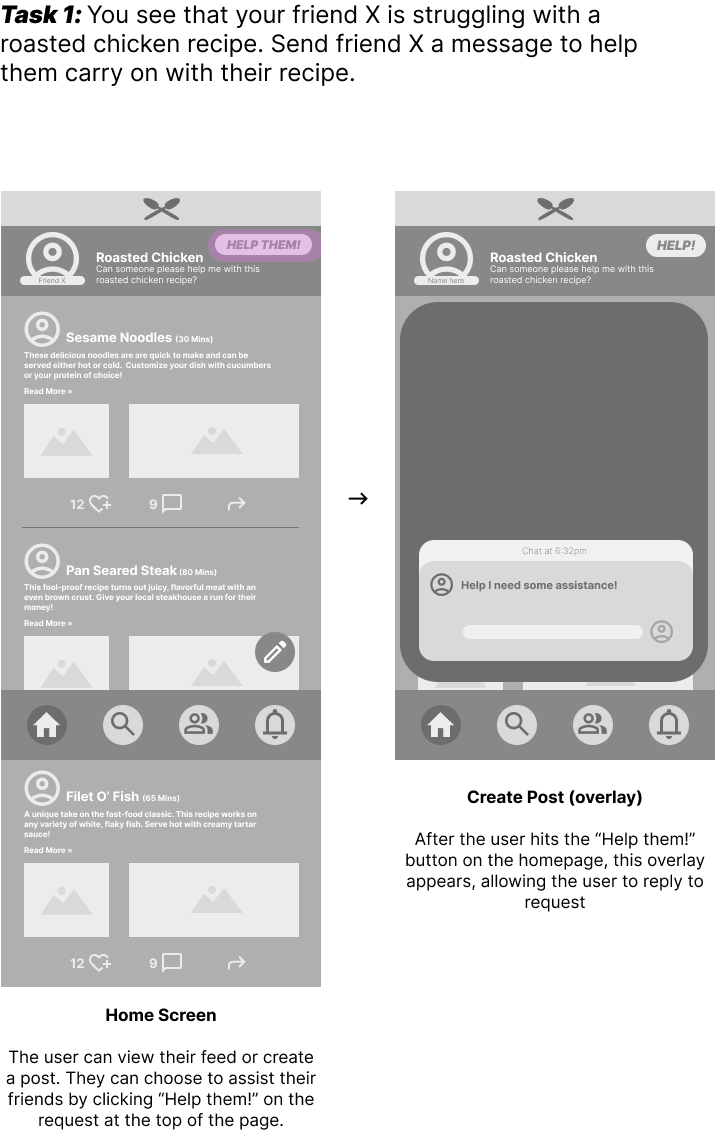
We conducted an initial round of usability testing with 5 users on mid-fidelity prototypes to determine the intuitiveness and user- friendliness of our design before we move into high-fidelity prototyping. With observe how target users like Sophia might move through our product, we are able to determine how quickly and easily users can complete tasks in the application, and whether there are any blockers to the successful and direct completion of the task.
Here are the main insights and changes from each round of testing:
Make “help” section more prominent, and have it enter screen with animation to draw attention.
Make clickable space larger on each recipe post.
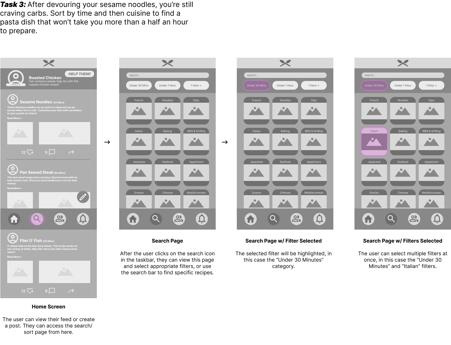
Allow for flexibility when sorting by cuisine before sorting by time.
Our team developed three tasks to test:
Help friends on a recipe
Ask for assistance when struggling with a recipe
Search a recipe
Branding
Logo iterations and the color scheme of the website:


Hi-fidelity Wireframes and User Flows
Before transforming to Hi-Fidelity wireframes, I made some necessary changes on Mid-Fidelity wireframes. I also added more screens to make the user experience of each function more complete compared with initial Mid-Fidelity wireframes. Myself and another designer continued working on the UI design of mobile web in order to transformed it to Hi-Fidelity wireframes.
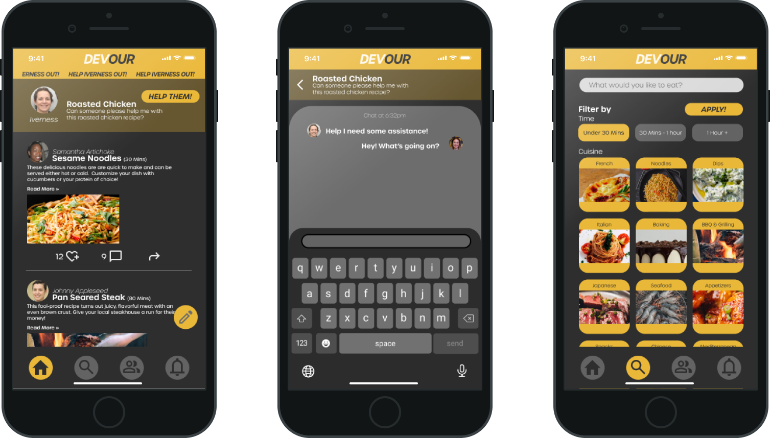
The help section is more prominent with animation to draw attention.
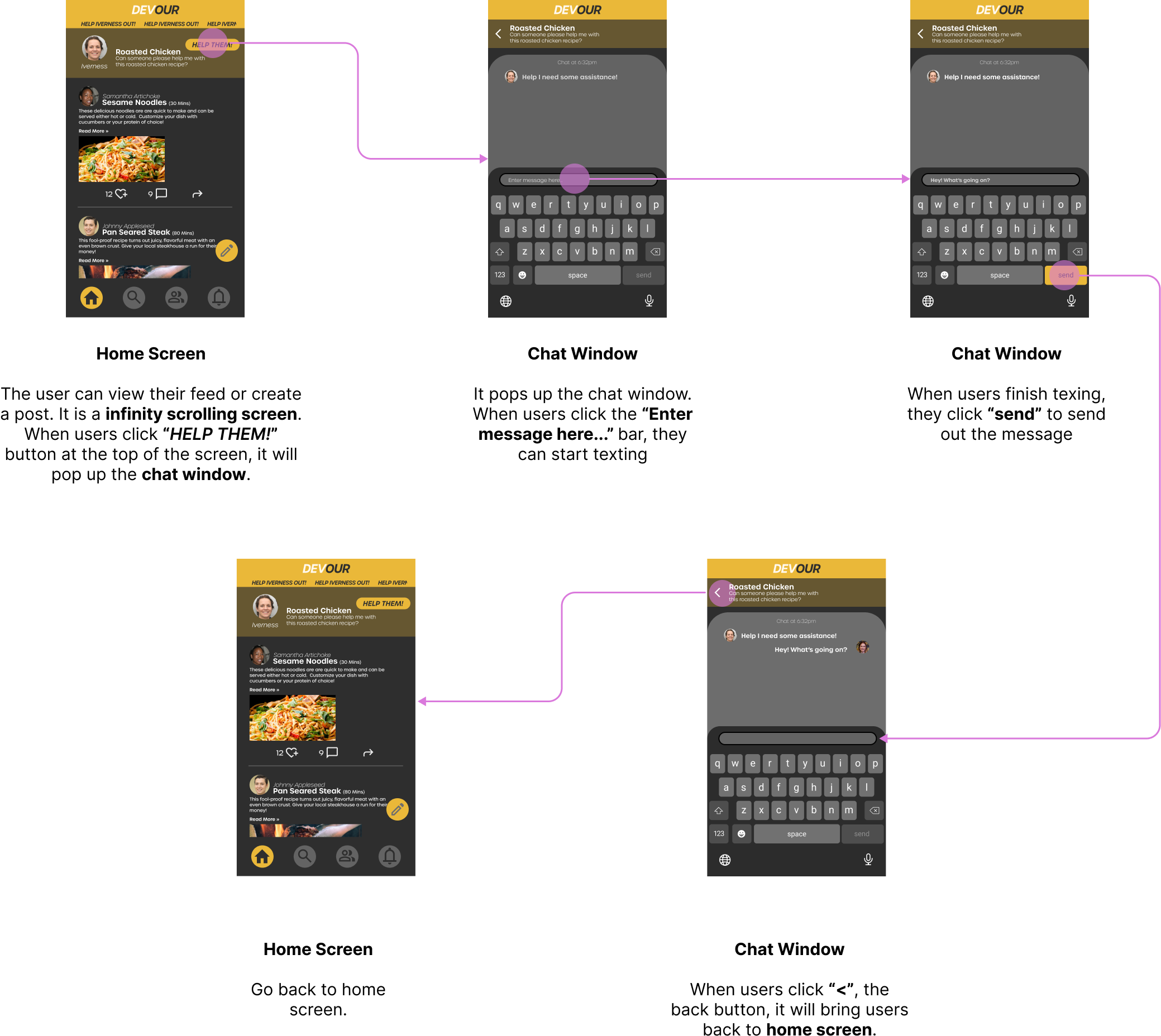
I added more screen and back icon. Now users can send out a real massage and return to home screen.
I enlarged the clickable space on recipes post. Users can click any part of the recipe post to see the detail.
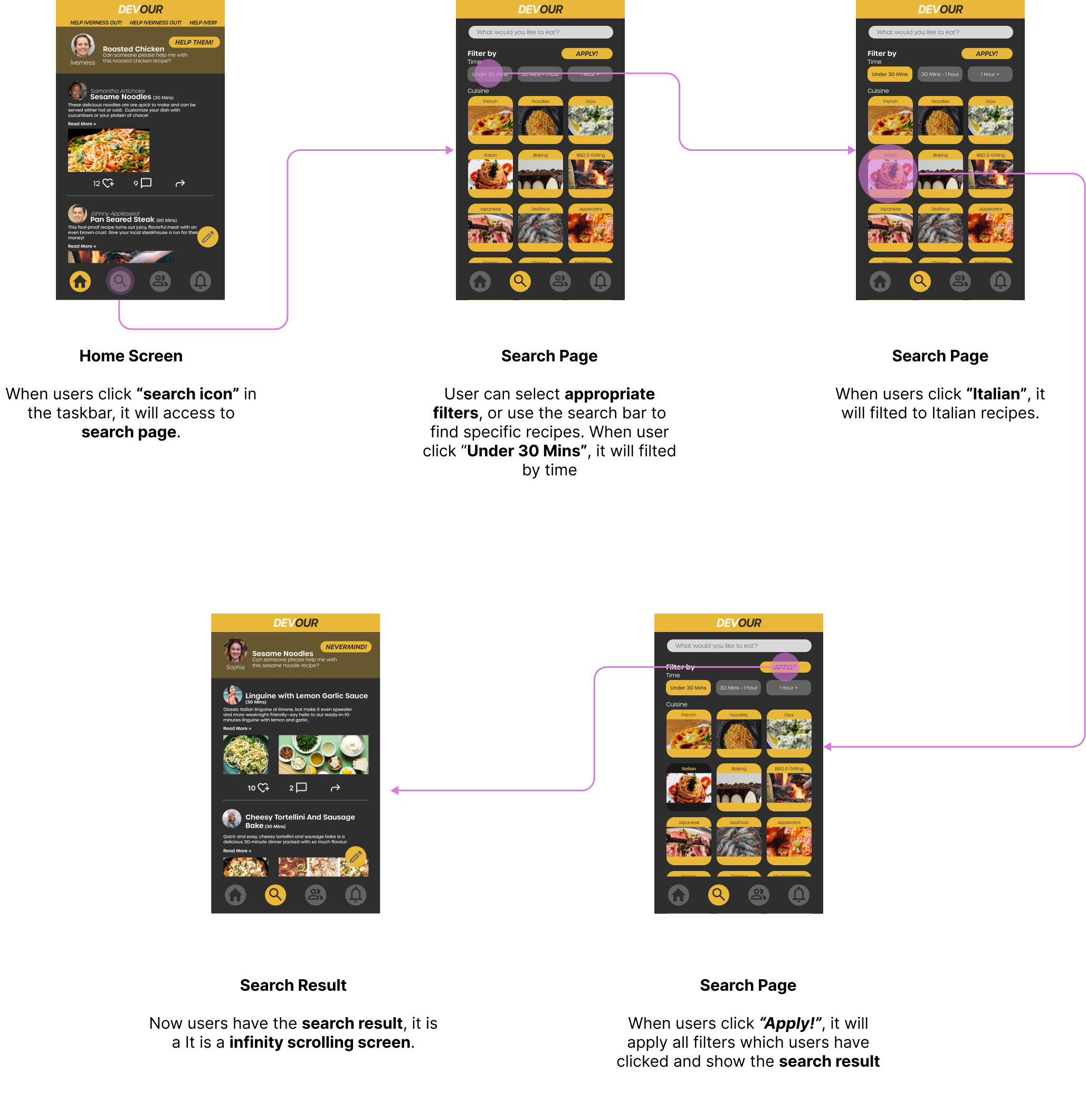
I added a clear filter section-by time and by cuisine. An “Apply” button was added. When users click “APPLY!”, it will apply all filters which users have clicked. I added the search result screen.
Prototype
Usability Testing Round 2
To test if our improvements brought about greater usability, we conducted another round of usability tests following the same 3 tasks from round 1, with 5 new users. When comparing the data from both rounds of tests, we can determine if users found our tasks easier than before.
All easiest rating are increased. Especially the search function, it is increased by 0.9 which is 24% increased. Users found the updated version is more usable than the first version. Users did suggest they want more labeling of buttons and icons.
What I’d like to do next?
With insights from 2nd round usability testing, update the design
Consider adding features we put on back burner. Such as video call, upload video, adding ingredients to grocery cart with third party delivery service. The share function will be functional and it allows users to share recipes to other social media platforms like instagram, facebook, twitter and etc. It will help to bring more users to our platform.
With more new features added, will conduct additional rounds of usability testing.
Create tablet version, conduct usability tests for both desktop and tablet.
